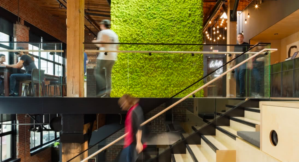
The Interior of the Offices of World-Famous Companies
It is always a great idea to draw design inspirations from renowned companies. The best offices let employees focus while allowing them to take a break and unwind simultaneously. This is why the interior design of these companies will give you an idea as to how you can provide the best of both worlds through your designs. Let’s take a look at the interiors of some of the most famous offices
Googleplex
Google’s headquarters, located in Mountain View has over 2,000,000 square feet of office space. The design is a perfect mix of sprawling, and whimsical, acting as a trailblazer to the modern, dreamy workplace that places importance on collaborative efforts and mixed-use spaces.

Work areas for groups are often encased with minimalistic glass screens as a noise buffer. The office interior design includes lots of collaborative spaces and open areas. It is divided into 13 zones characterized from hot to cold, based on the amount of employee interaction and how space was used.
The design varies from landmarks to zones of activity to circulation routes. There are also designs for glass tents to keep up with the rapid pace of expansion, and very few individual offices. It has a highly personalized design that stimulates the creative mind.
Slack
This firm’s San Francisco office has a beautifully designed interior, themed to represent the planet earth. Each floor holds design elements from a region of the Pacific Crest Trail.

This goes from southern California to the Pacific Northwest, and the office interior design draws inspiration from deserts, mountains, and forests. This is prominent, with a base camp at the lobby, where employees can meditate in tents before beginning their ascent.
Facebook (Poland)
Facebook’s Poland office has a very different style of decoration, providing a fresh and friendly environment to work in. The overall blue and white theme to align with the typical color for Facebook is accentuated by neon signs for Warsaw.
Most of the art and furniture are designed by local Polish designers. There are clean spaces with a modern look and have cartoon characters imprinted on the walls. Clean lines and sleek edges, along with the occasional blacks give a nice sense of contrast.
Amazon
The Amazon Seattle office is designed with industrial cool tones and steel, with offsets of vibrant red. There are indoor and outdoor spaces and the work and lounge areas blend perfectly. This office implements an open floor plan.

Airbnb
AirBnB’s San Francisco office has camping style tents used as offices in white, orange, and brown undertones. The design is minimalistic and reflects the ideas of openness and collaborations. Each room is distinct and draws inspiration from Airbnb listings that hold significance and style.

Pictures: www.unsplash.com, www.slack.com, www.airbnb.com